IMS Center for Physician Recruitment
I’ve seen it many times…great ideas…and great ideas getting crushed. Most people fall into the trap of thinking that if something is “good” it should speak for itself and that no sales pitch needs to be made. This couldn’t be farther from the truth. The difference between an idea becoming successful and an idea failing is more often tied to marketing rather than its actual potential.
A bad idea with great marketing will generate more money, than a great idea with awful marketing. Now, the bad idea will probably eventually die off, but not before it has made a lot of money for its creator. Many get rich quick or lose weight fast schemes come to mind.
Never go into a presentation without knowing what you want, what the strengths of your product are and a marketing piece that nicely displays and highlights all those strengths. When you leave you want to leave something behind that will make them remember you and make them think twice about dismissing your idea.
The Brochure
As an example of a leave behind brochure I’m going to talk about the IMS Center for Physician Recruitment (IMS CPR) brochure and how it helped us make the case and get funding for this project.
As mentioned before the brochure has to make an impact quickly and effectively which is why certain design elements need to be kept in mind. Here are some key points:
Keep it short
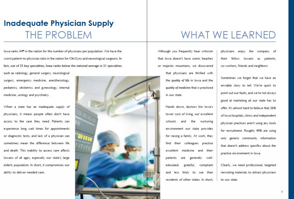 Most companies that are considering your product want to have a quick and succinct overview of your project. They don’t want to spend a weekend reading your material, they want the key points why they should take you seriously and why this is worth their money. When you go in for the second interview you can go into more detail.
Be bold
 This isn’t the time for 8pt type! It’s time for big catchy headlines, and nice bold paragraphs. Make it a quick and easy read that stands out and is confident.
Powerful images
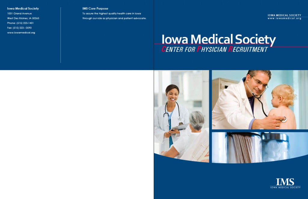 You don’t need to have 20 pictures in your brochure. Very often a few large complimentary images are what will catch people’s eye. Again it’s important to display confidence with your images.
Coherent structure
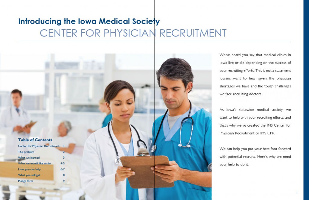 Just like any good book your brochure should have a beginning, middle and end. Which means you need to lay out the current problem, introduce your product and how it solves said problem, and finally how the investor can be involved.
Words are power
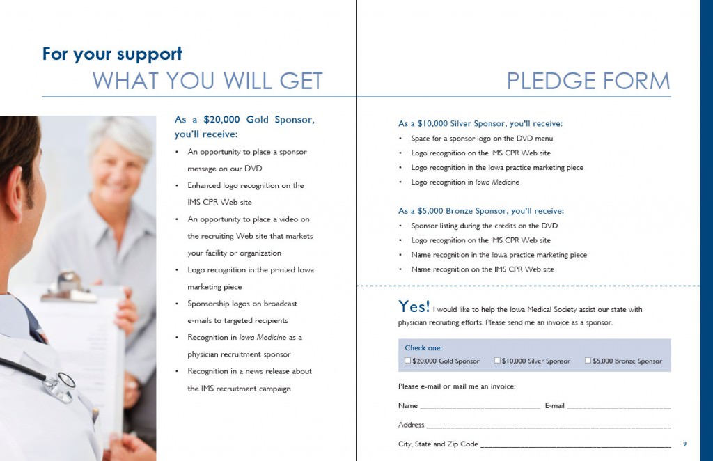 This is one of the most critical components of your brochure! Writing compelling and conversational copy is absolutely critical! Nothing will discredit you more than spelling errors and poor grammar.
Conclusion: Design is Power
Asking for funding for a project is never an easy task. Unfortunately a lot of businesses make it even harder on themselves by asking for sponsorship without a proper plan and without a marketing piece to help them make their case.
The key to remember is that no matter how good your project is without a good marketing strategy it will fail.
There you have it! A quick overview on what it takes to make a brochure successful. Of course there is a lot more to the process which is why hiring a good graphic designer is important. But if nothing else this should give you a bit better understanding and appreciation of what it involved in creating good marketing piece.


